Click the image to see some analysis of the magazine cover.
Portfolio Sections
- A. Final Product: Main Product (1)
- B. Final Product: Ancillary Text (2)
- C.1 Evaluation Question 1 (1)
- C.2 Evaluation Question 2 (1)
- C.3 Evaluation Question 3 (1)
- C.4 Evaluation Question 4 (1)
- D. Appendix 1: Research for Main Product (10)
- E. Appendix 2: Pre-production planning for Main Product (4)
- F. Appendix 3: Research and Pre-Production planning for Ancillary Texts (4)
Monday, 28 March 2011
The Spare Room - Magazine Cover
Monday, 14 March 2011
How did you use new media technologies in the construction and research, planning and evluation stages?
Research and Planning:
Through this stage of the project, Google, Youtube, and SurveyMonkey were exceptionally useful. Youtube and Google were used to gather source material which was then used in the research process. The search engine, Google, was used often to find clips, information, and images on all different topics of the project, such as the history of horror and different posters to compare and comment on. YouTube was used to find and collect different trailers to give ideas to ourselves which we could then use in our own production. SurveyMonkey was a particularly useful piece of software that allowed us to create, collect, and observe our target audience questionnaire and responses. The only new technology I had to learn to use was SurveyMonkey, however the website was easily navigable and clearly laid out, making it a simple, and effective tool to get to grips with.
Production:
The hardware shown in the image was the most important part of the whole project. Without this, there would have been no footage to edit, and present as a final piece! I had used the cameras and tripods before, and was therefore comfortable using them again, and at times had to explain how to use the equipment to the other members of my group. Another very important aspect of the production was the use of FinalCutPro, LiveType, and Photoshop. These technologies I was not particularly used to, and only knew of their basic functions. However, through perseverance and experimentation I feel I used the software to full effect.
Evaluation:
Blogger and Flickr were vital at this stage. This was because these were used to present the evaluation. Flickr was used to annotate images, by highlighting the area to comment on, and adding a note. Blogger was used to host all of my observations and notes on all aspects of the project. I knew how to use these two websites has I had previously used them in coursework last year.
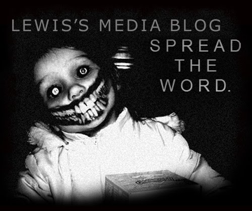
Click the image to see some further analysis.
Sunday, 13 March 2011
What have you learnt from audience feedback?
- The close ups at the very start. They were visually appealing, and well framed. They put the audience in an uneasy position, as the canted angle adds something out of the ordinary to an ordinary shot of starting a car, or changing gear.
- The sound of the radio tuning. Again, this sound removes the audience from their comfort zone, as the sound doesn't quite fit with the visuals - making it perfect for a horror trailer.
- The CCTV/camcorder footage, which foreshadows the rest of the film. Although only shown breifly, it gives away the majority of the films plot. This may be seen as a bad thing by some viewers, however with horror films we felt the audience would pretty much know what they were going to get. Therefore presented them with the setting, characters and just a little bit of narrative without giving too much away, as a sort of taster before the main production.
- The quick shots worked well in creating atmosphere, and giving the feeling of being trapped. These shots reveal some of the tortures the characters are put under, making the audience sympathise with them, making sure they know who the good guys and bad guys are.
- The gore/torture shots, which were well framed, and well acted. Again, they present the idea that these characters are trapped, and helpless, encouraging sympathy from the audience.
- The audience mentioned they could clearly distinguish between good and bad characters. Which they felt was a good thing, and that knowing the protagonist and antagonist before seeing the film was a good thing. This may be because they do not want to waste some of the film length in developing characters, and that they may just want to slip straight into a film with people being drilled into and hit with hammers.
- The inter-titles could possibly be a little clearer, and on the screen for longer. Although they showed a clear message, they didn't really fit in with the rest of the film. So we made the text slightly smaller, and changed the font to a slightly clearer, sharper font.
- Possibly given away too much of the plot. You never want a trailer to tell you the complete story from the film, we may have given a bit too much narrative in our trailer, however by showing this the audience get the see the characters involved, what their role is, and a breif introduction to the film.
- The effect on the title seemed misplaced. The original title had a ghostly effect, this would have been great if our film had a supernatural theme, which of course it doesnt. The title effect and font now connote a rusty, hardcore, torture film, along with the sound of the dragging pitchfork, these signs give great clues to the audience about the genre of the film.
- Remove the shot of the ghost in the road, which was originally why they crashed. The ghost (which can be seen in the first cut of the trailer) was found innapropriate by our target audience, as they didn't really know where it came from or why it was there. The amature style of making it appear in the road also gave the trailer a rough and unfinished feel. So we removed this shot, and simply had the characters mysteriously break down, and replaced the ghost with a shot of the bonnet lifted - although these lacks definition it is more clear the the audience.
How effective is the combination of your main product and ancillary texts?
In what ways does your media product use, develop, or challenge forms and conventions of real media products?
I have collected some stills from existing media products, and compared them to stills from my product. In the analysis, I have talked about what makes them similar, and different in terms of conventions and forms.
Click the image to see analysis of the stills.
The Spare Room Movie Poster
Click the image to see some analysis of the movie poster.


